M
Mercimeks
Stüdyo
3 February 2026
5 min
#Brand#Design
Identity does not end when the logo is delivered. If visitors do not see the same family on the site, the quote PDF, and the card, the brand is ignored.
What is held
- Primary colour: buttons, accents, sometimes the mark
- Ground and type: readable contrast
- Typefaces: a heading and body pair — not one flashy display font
- Corner radius: buttons and cards on the same scale
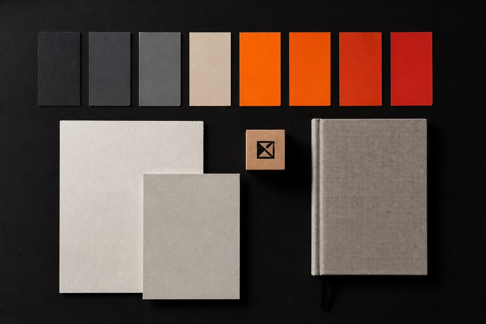
gelir.ai uses a teal square and a mint dot; the button stays in the same green family. It does not split. At Mercimeks the orange–red gradient sits on buttons and rules — not as glow on every card.
On the site
The logo should keep the same stroke on a light header and a dark hero. The PDF colour should not become “approximately orange” on the web. If colour codes and typefaces are written down, the next page does not drift.
When a mark is enough
Internal use, one card, no product yet — a mark is enough. When a customer-facing surface opens, identity needs a system.
For identity and site, see projects.
NextOne page or a corporate site?↓