Overview
Multilingual corporate site for catalytic converters, flexibles, and lubricants. TR / EN / RU on a navy–blue system.
Multilingual corporate site for catalytic converters, flexibles, and lubricants. TR / EN / RU on a navy–blue system.
Manufacturing, wholesale, and export under one roof. The site had to hold the Ankara office and the Kyrgyzstan–China line — a measurable corporate system, not template navy.
We locked tokens as CSS variables: --tj-color-theme-primary #0075FF, heading #051229, dark #071D43, body Lato / heading Libre Franklin. Logo, CTA, and locale keys share the same blue family.
Color
#0075FF
Primary
#051229
Heading
#071D43
Dark
#E1E8F0
Wash
#F7F7F7
White
Type
Libre Franklin — Headings · Lato — Body 16px
Form
Pill CTA · locale 4–8px · hard card corners
Logo

Custom wordmark: A and D joined, P’s bowl left open — logistics and connection. Single color #0075FF, ® at the top right. Same stroke weight on navy and on the white header.
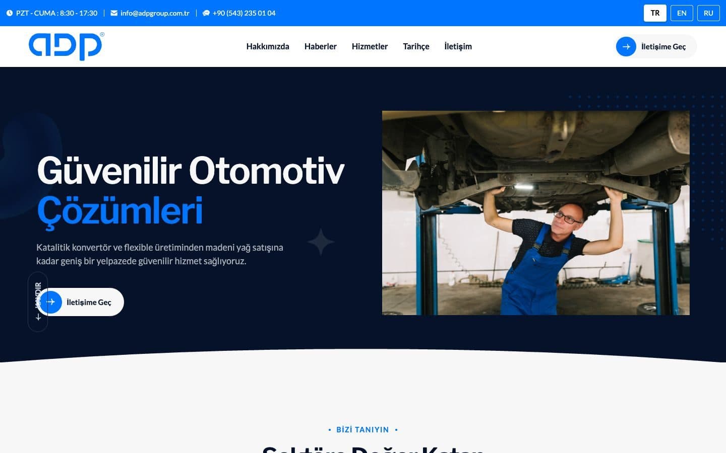
Hours, email, WhatsApp stay visible. TR / EN / RU are square keys — for an export firm, language is an entry point, not decoration.
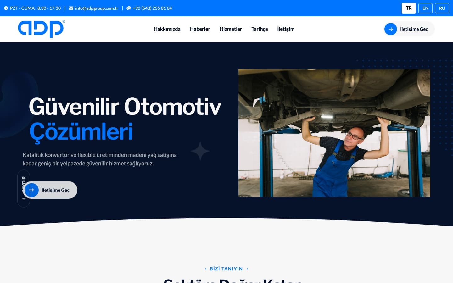
Claim on the left, workshop photo on the right. “Çözümleri” in primary blue. A white wave at the bottom eases dark hero into trust cards.
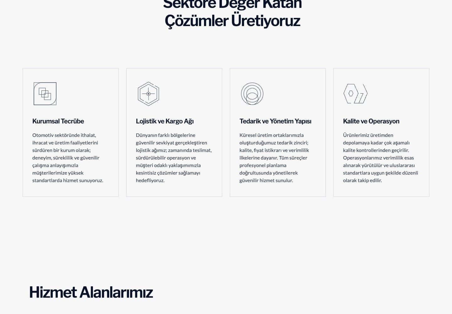
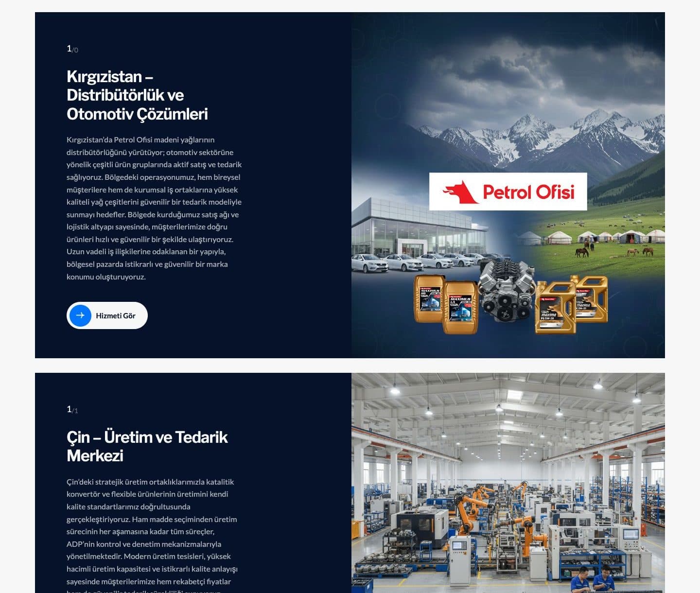
Four thin-icon cards (experience, logistics, supply, quality), then KG / CN / TR service blocks. Visitors see who, then where.