Overview
Repair, production, and R&D for defence and medical electronics. Service families, sectors, and contact on one spine.
Repair, production, and R&D for defence and medical electronics. Service families, sectors, and contact on one spine.
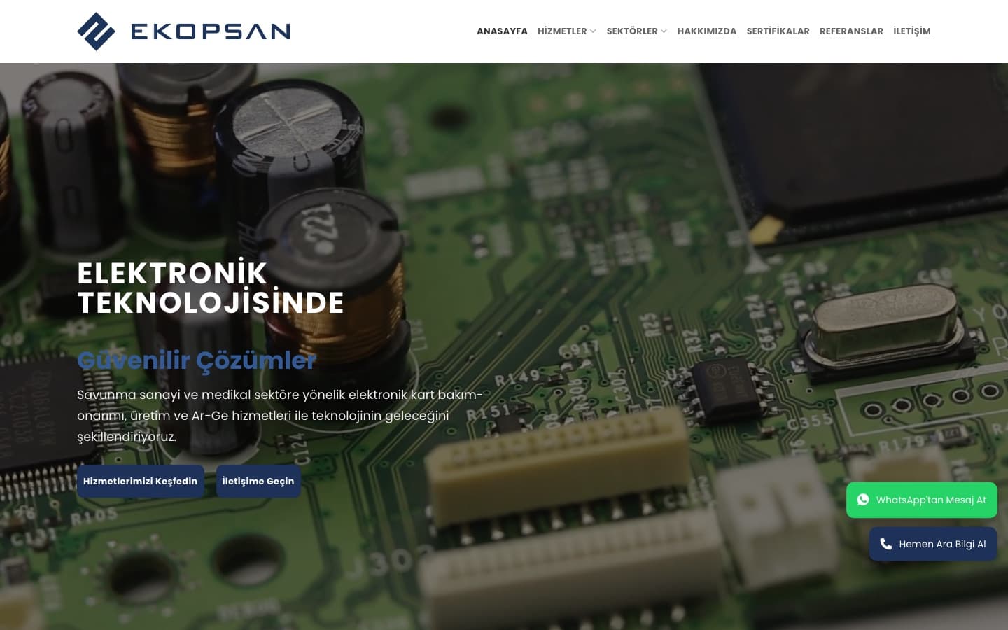
Repair, production, and R&D under one roof. If the site is one “electronics firm” slide, purchasing cannot find the right door.
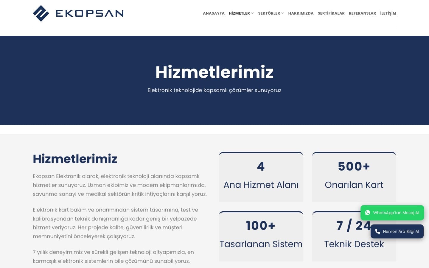
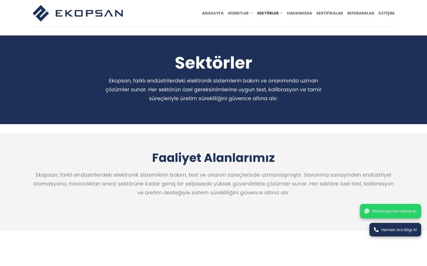
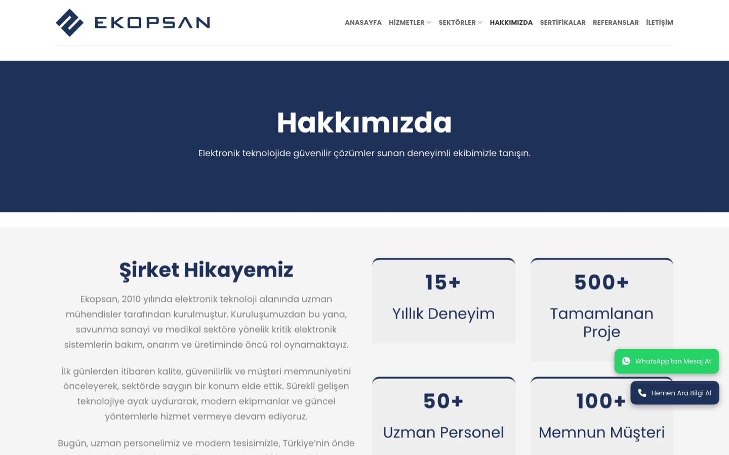
We split service and sector. Home shows the work; /hizmetler and /sektorler go deeper. Form and phone stay on every surface.
Color
#0B1220
Ink
#1E4A8A
Accent
#FFFFFF
Paper
#5B6472
Mute
Type
Inter — Display + body
Form
Pill CTA · kart 16px
Logo

Mark: diamond / PCB-trace geometry in navy. Wordmark EKOPSAN — caps, open tracking. Accent blue on headings and pill CTAs.
Repair, assembly, R&D, reverse engineering, production, field. Six cards; visitors pick the job, then go deeper.
Defence, medical, aviation, automation on their own page. Someone looking for radar or a patient monitor does not land on a “digital transformation” hero.
Ankara OSB address, two lines, WhatsApp, and a form. Hidden contact breaks trust on critical electronics work.
Industry
Defence / medical electronics
Technologies
Next.js · React · Content architecture
Outcomes